User login
Language
Anonymous's groups in this site
User is not a member of any group.
Your groups across all your sites
User is not a member of any group.
Recent Content
Who's online
There are currently 0 users online.
You are here
Sun, 2013-03-31 15:49 — Kathy Gilbeaux
(TO ENLARGE MAP - CLICK ON MAP IMAGE BELOW)
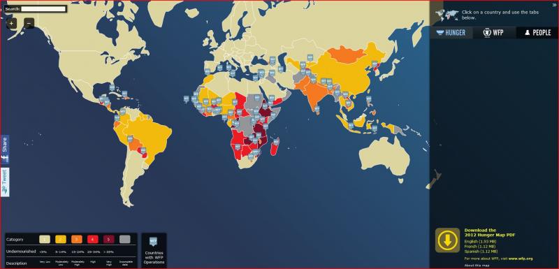
The map shows the prevalence of undernourishment in the total population as of 2010 - 2012. The indicator is an estimate of the percentage of the population having access to an amount of energy from food insufficient to maintain a healthy life.
Country / Region Tags:
General Topic Tags:
Problem, Solution, SitRep, or ?:
Groups this Group Post belongs to:


Recent Comments