User login
Language
Anonymous's groups in this site
User is not a member of any group.
Your groups across all your sites
User is not a member of any group.
Recent Content
Who's online
There are currently 0 users online.
You are here
Here’s What Global Warming Looks Like Month By Month for 137 Years
Primary tabs
Here’s What Global Warming Looks Like Month By Month for 137 Years
Sun, 2018-09-09 18:19 — Kathy Gilbeaux(CLICK ON THE IMAGE BELOW TO ENLARGE)
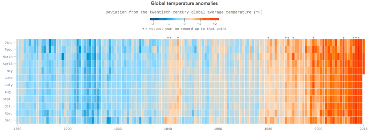
Data: National Oceanic and Atmospheric Administration; Chart: Chris Canipe/Axios
axios.com - by Chris Canipe, Andrew Freedman - June 21, 2018
The Earth is warmer now than at any time since reliable record-keeping began in 1880, and we're continuing to warm at an accelerated rate. In fact, the Earth is warmer now than at any point in modern human civilization.
The context: 2017 was the third-warmest year on record, and the seven warmest years have occurred since 2010. This chart shows temperature anomalies — which is a departure from an average long-term baseline temperature — for every month since January 1880, compared to the average temperature between the years 1901 and 2000. The data is constructed from thousands of available, quality-controlled land and sea surface temperature readings across the world, and runs through May 2018.
(CLICK HERE - READ COMPLETE ARTICLE)
CLICK HERE - NOAA - Climate At A Glance - Global Time Series
CLICK HERE - Climate Science Special Report - Fourth National Climate Assessment (NCA4), Volume I
Recent Comments